ScrollingFrame
ScrollingFrame is a special Frame type with built-in scrolling
interactivity and different ways to customize how the scrolling works.
| Memory category | Gui |
|---|
Member index 32
Removed member index 2
| History | Member | |
|---|---|---|
| 290 | AutoSizeCanvas: bool | |
| 290 | AutoSizeCanvasPadding: UDim2 |
Description
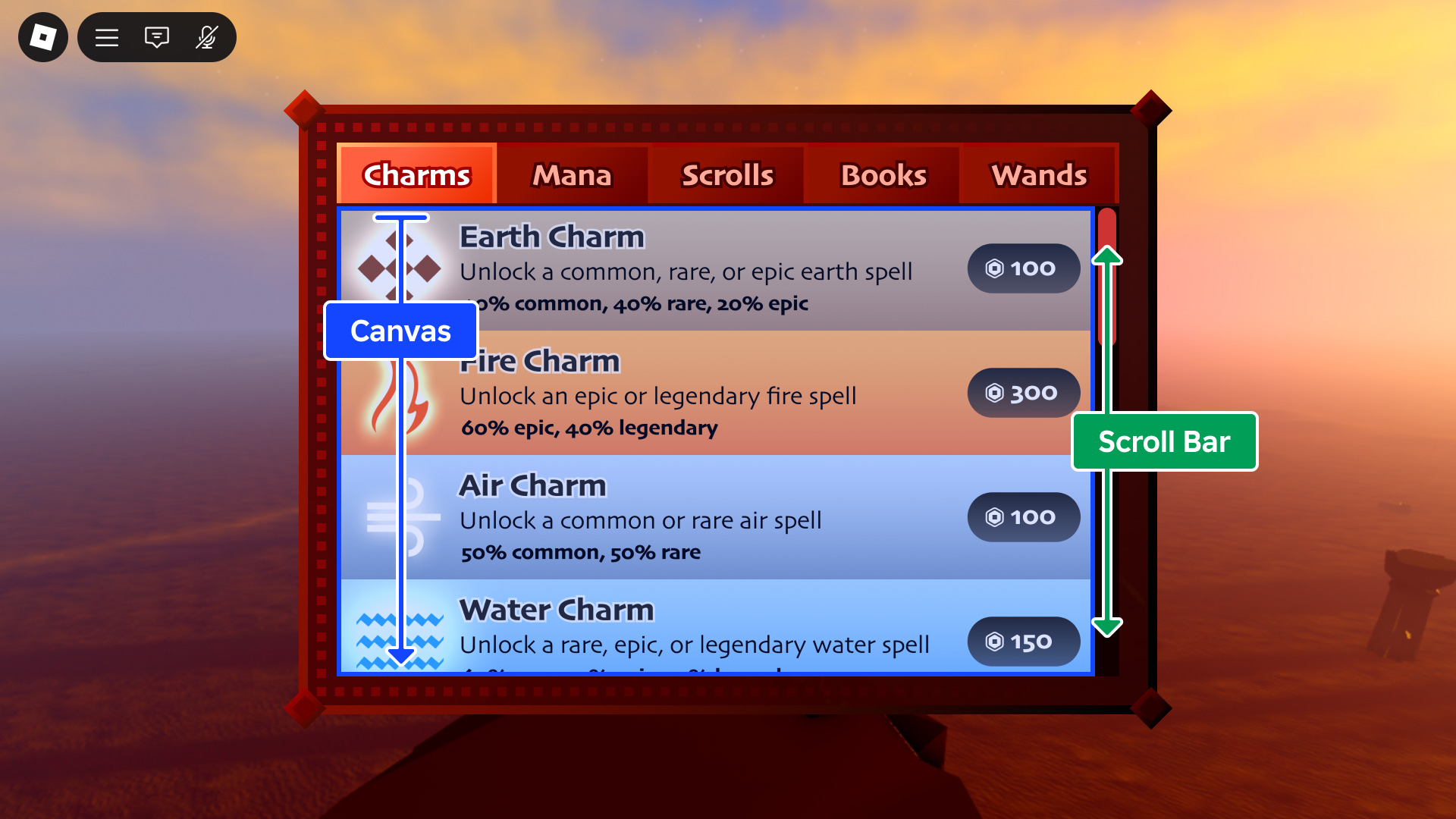
ScrollingFrame is a special Frame type with built-in scrolling
interactivity and different ways to customize how the scrolling works.
History 176
- 731 Change Default of VerticalScrollBarPosition from to Right
- 731 Change Default of VerticalScrollBarInset from to None
- 731 Change Default of from to Rect(0, 0, 0, 0)
- 731 Change Default of TopImageContent from to
- 731 Change Default of TopImage from to ContentId(rbxasset://textures/ui/Scroll/scroll-top.png)
- 731 Change Default of from to true
- 731 Change Default of ScrollingEnabled from to true
- 731 Change Default of ScrollingDirection from to XY
- 731 Change Default of from to Vector2(0, 0)
- 731 Change Default of from to 1
- 731 Change Default of ScrollBarThickness from to 12
- 731 Change Default of ScrollBarImageTransparency from to 0
- 731 Change Default of ScrollBarImageColor3 from to Color3(1, 1, 1)
- 731 Change Default of MidImageContent from to
- 731 Change Default of MidImage from to ContentId(rbxasset://textures/ui/Scroll/scroll-middle.png)
- 731 Change Default of from to Vector2(0, 0)
- 731 Change Default of HorizontalScrollBarInset from to None
- 731 Change Default of from to Rect(0, 0, 0, 0)
- 731 Change Default of ElasticBehavior from to WhenScrollable
- 731 Change Default of from to None
- 731 Change Default of CanvasSize from to UDim2({0, 0}, {2, 0})
- 731 Change Default of CanvasPosition from to Vector2(0, 0)
- 731 Change Default of BottomImageContent from to
- 731 Change Default of BottomImage from to ContentId(rbxasset://textures/ui/Scroll/scroll-bottom.png)
- 731 Change Default of AutomaticCanvasSize from to None
- 731 Change Default of AbsoluteWindowSize from to Vector2(0, 0)
- 731 Change Default of AbsoluteCanvasSize from to Vector2(0, 0)
- 726 Change Default of VerticalScrollBarPosition from Right to
- 726 Change Default of VerticalScrollBarInset from None to
- 726 Change Default of from Rect(0, 0, 0, 0) to
- 726 Change Default of TopImageContent from to
- 726 Change Default of TopImage from ContentId(rbxasset://textures/ui/Scroll/scroll-top.png) to
- 726 Change Default of from true to
- 726 Change Default of ScrollingEnabled from true to
- 726 Change Default of ScrollingDirection from XY to
- 726 Change Default of from Vector2(0, 0) to
- 726 Change Default of from 1 to
- 726 Change Default of ScrollBarThickness from 12 to
- 726 Change Default of ScrollBarImageTransparency from 0 to
- 726 Change Default of ScrollBarImageColor3 from Color3(1, 1, 1) to
- 726 Change Default of MidImageContent from to
- 726 Change Default of MidImage from ContentId(rbxasset://textures/ui/Scroll/scroll-middle.png) to
- 726 Change Default of from Vector2(0, 0) to
- 726 Change Default of HorizontalScrollBarInset from None to
- 726 Change Default of from Rect(0, 0, 0, 0) to
- 726 Change Default of ElasticBehavior from WhenScrollable to
- 726 Change Default of from None to
- 726 Change Default of CanvasSize from UDim2({0, 0}, {2, 0}) to
- 726 Change Default of CanvasPosition from Vector2(0, 0) to
- 726 Change Default of BottomImageContent from to
- 726 Change Default of BottomImage from ContentId(rbxasset://textures/ui/Scroll/scroll-bottom.png) to
- 726 Change Default of AutomaticCanvasSize from None to
- 726 Change Default of AbsoluteWindowSize from Vector2(0, 0) to
- 726 Change Default of AbsoluteCanvasSize from Vector2(0, 0) to
- 703 Add ResetScrollVelocity
- 703 Add GetScrollVelocity
- 677 Add TopImageContent
- 677 Add MidImageContent
- 677 Add BottomImageContent
- 665 Add
- 665 Add
- 650 Add
- 645 Change ValueType of TopImage from Content to ContentId
- 645 Change ValueType of MidImage from Content to ContentId
- 645 Change ValueType of BottomImage from Content to ContentId
- 573 Change ReturnType of ScrollToTop from void to null
- 573 Change ReturnType of ClearInertialScrolling from void to null
- 553 Change Default of VerticalScrollBarPosition from to Right
- 553 Change Default of VerticalScrollBarInset from to None
- 553 Change Default of from to Rect(0, 0, 0, 0)
- 553 Change Default of TopImage from to ContentId(rbxasset://textures/ui/Scroll/scroll-top.png)
- 553 Change Default of ScrollingEnabled from to true
- 553 Change Default of ScrollingDirection from to XY
- 553 Change Default of from to Vector2(0, 0)
- 553 Change Default of ScrollBarThickness from to 12
- 553 Change Default of ScrollBarImageTransparency from to 0
- 553 Change Default of ScrollBarImageColor3 from to Color3(1, 1, 1)
- 553 Change Default of MidImage from to ContentId(rbxasset://textures/ui/Scroll/scroll-middle.png)
- 553 Change Default of from to Vector2(0, 0)
- 553 Change Default of HorizontalScrollBarInset from to None
- 553 Change Default of from to Rect(0, 0, 0, 0)
- 553 Change Default of ElasticBehavior from to WhenScrollable
- 553 Change Default of CanvasSize from to UDim2({0, 0}, {2, 0})
- 553 Change Default of CanvasPosition from to Vector2(0, 0)
- 553 Change Default of BottomImage from to ContentId(rbxasset://textures/ui/Scroll/scroll-bottom.png)
- 553 Change Default of AutomaticCanvasSize from to None
- 553 Change Default of AbsoluteWindowSize from to Vector2(0, 0)
- 553 Change Default of AbsoluteCanvasSize from to Vector2(0, 0)
- 501 Add
- 496 Change ThreadSafety of AbsoluteCanvasSize from ReadSafe to Unsafe
- 496 Change Tags of AbsoluteCanvasSize from [Hidden, ReadOnly, NotReplicated] to [ReadOnly, NotReplicated]
- 496 Change ReadSecurity of AbsoluteCanvasSize from RobloxScriptSecurity to None
- 496 Change Category of AbsoluteCanvasSize from Debugging to Scrolling
- 496 Change CanSave of AbsoluteCanvasSize from false to true
- 496 Change WriteSecurity of AbsoluteCanvasSize from RobloxScriptSecurity to None
- 486 Change ThreadSafety of VerticalScrollBarPosition from ReadOnly to ReadSafe
- 486 Change ThreadSafety of VerticalScrollBarInset from ReadOnly to ReadSafe
- 486 Change ThreadSafety of from ReadOnly to ReadSafe
- 486 Change ThreadSafety of TopImage from ReadOnly to ReadSafe
- 486 Change ThreadSafety of ScrollingEnabled from ReadOnly to ReadSafe
- 486 Change ThreadSafety of ScrollingDirection from ReadOnly to ReadSafe
- 486 Change ThreadSafety of ScrollBarThickness from ReadOnly to ReadSafe
- 486 Change ThreadSafety of ScrollBarImageTransparency from ReadOnly to ReadSafe
- 486 Change ThreadSafety of ScrollBarImageColor3 from ReadOnly to ReadSafe
- 486 Change ThreadSafety of MidImage from ReadOnly to ReadSafe
- 486 Change ThreadSafety of from ReadOnly to ReadSafe
- 486 Change ThreadSafety of HorizontalScrollBarInset from ReadOnly to ReadSafe
- 486 Change ThreadSafety of from ReadOnly to ReadSafe
- 486 Change ThreadSafety of ElasticBehavior from ReadOnly to ReadSafe
- 486 Change ThreadSafety of CanvasSize from ReadOnly to ReadSafe
- 486 Change ThreadSafety of CanvasPosition from ReadOnly to ReadSafe
- 486 Change ThreadSafety of BottomImage from ReadOnly to ReadSafe
- 486 Change ThreadSafety of AutomaticCanvasSize from ReadOnly to ReadSafe
- 486 Change ThreadSafety of AbsoluteCanvasSize from ReadOnly to ReadSafe
- 462 Change ThreadSafety of ScrollToTop from to Unsafe
- 462 Change ThreadSafety of GetSampledInertialVelocity from to Unsafe
- 462 Change ThreadSafety of ClearInertialScrolling from to Unsafe
- 462 Change ThreadSafety of VerticalScrollBarPosition from to ReadOnly
- 462 Change ThreadSafety of VerticalScrollBarInset from to ReadOnly
- 462 Change ThreadSafety of from to ReadOnly
- 462 Change ThreadSafety of TopImage from to ReadOnly
- 462 Change ThreadSafety of ScrollingEnabled from to ReadOnly
- 462 Change ThreadSafety of ScrollingDirection from to ReadOnly
- 462 Change ThreadSafety of ScrollBarThickness from to ReadOnly
- 462 Change ThreadSafety of ScrollBarImageTransparency from to ReadOnly
- 462 Change ThreadSafety of ScrollBarImageColor3 from to ReadOnly
- 462 Change ThreadSafety of MidImage from to ReadOnly
- 462 Change ThreadSafety of from to ReadOnly
- 462 Change ThreadSafety of HorizontalScrollBarInset from to ReadOnly
- 462 Change ThreadSafety of from to ReadOnly
- 462 Change ThreadSafety of ElasticBehavior from to ReadOnly
- 462 Change ThreadSafety of CanvasSize from to ReadOnly
- 462 Change ThreadSafety of CanvasPosition from to ReadOnly
- 462 Change ThreadSafety of BottomImage from to ReadOnly
- 462 Change ThreadSafety of AutomaticCanvasSize from to ReadOnly
- 462 Change ThreadSafety of AbsoluteWindowSize from to Unsafe
- 462 Change ThreadSafety of AbsoluteCanvasSize from to ReadOnly
- 454 Change MemoryCategory of ScrollingFrame from Instances to Gui
- 452 Change MemoryCategory of ScrollingFrame from Gui to Instances
- 453 Change MemoryCategory of ScrollingFrame from Instances to Gui
- 452 Add
- 452 Add
- 452 Add
- 452 Add AbsoluteCanvasSize
- 449 Add AutomaticCanvasSize
- 392 Add GetSampledInertialVelocity
- 392 Add ClearInertialScrolling
- 348 Add ScrollBarImageTransparency
- 348 Add ScrollBarImageColor3
- 329 Add ScrollingDirection
- 329 Add ElasticBehavior
- 325 Add ScrollToTop
- 299 Add VerticalScrollBarPosition
- 299 Add VerticalScrollBarInset
- 299 Add HorizontalScrollBarInset
- 290 Remove AutoSizeCanvasPadding
- 290 Remove AutoSizeCanvas
- 287 Add AutoSizeCanvasPadding
- 287 Add AutoSizeCanvas
- 285 Remove AutoSizeCanvasPadding
- 285 Remove AutoSizeCanvas
- 286 Add AutoSizeCanvasPadding
- 286 Add AutoSizeCanvas
- 285 Remove AutoSizeCanvasPadding
- 285 Remove AutoSizeCanvas
- 286 Add AutoSizeCanvasPadding
- 286 Add AutoSizeCanvas
- 149 Add TopImage
- 149 Add ScrollingEnabled
- 149 Add ScrollBarThickness
- 149 Add MidImage
- 149 Add CanvasSize
- 149 Add CanvasPosition
- 149 Add BottomImage
- 149 Add AbsoluteWindowSize
- 149 Add ScrollingFrame
Members 32
AbsoluteCanvasSize
| Type | Default | |
|---|---|---|
| Vector2 | 0, 0 | |
The size of the area that is scrollable, in offsets. This property is set to the maximum of the CanvasSize property and the size of the children if AutomaticCanvasSize is set to something other than AutomaticSize.None.
| Thread safety | Unsafe |
|---|---|
| Category | Scrolling |
| Loaded/Saved | false/true |
History 12
- 731 Change Default of AbsoluteCanvasSize from to Vector2(0, 0)
- 726 Change Default of AbsoluteCanvasSize from Vector2(0, 0) to
- 553 Change Default of AbsoluteCanvasSize from to Vector2(0, 0)
- 496 Change ThreadSafety of AbsoluteCanvasSize from ReadSafe to Unsafe
- 496 Change Tags of AbsoluteCanvasSize from [Hidden, ReadOnly, NotReplicated] to [ReadOnly, NotReplicated]
- 496 Change ReadSecurity of AbsoluteCanvasSize from RobloxScriptSecurity to None
- 496 Change Category of AbsoluteCanvasSize from Debugging to Scrolling
- 496 Change CanSave of AbsoluteCanvasSize from false to true
- 496 Change WriteSecurity of AbsoluteCanvasSize from RobloxScriptSecurity to None
- 486 Change ThreadSafety of AbsoluteCanvasSize from ReadOnly to ReadSafe
- 462 Change ThreadSafety of AbsoluteCanvasSize from to ReadOnly
- 452 Add AbsoluteCanvasSize
AbsoluteWindowSize
| Type | Default | |
|---|---|---|
| Vector2 | 0, 0 | |
The size of the frame, in offsets, without the scroll bars. This read-only
property represents the visible content area of the ScrollingFrame: the
frame's AbsoluteSize minus the space
occupied by any currently visible scroll bar gutters
(ScrollBarThickness). If no
scroll bars are visible, this equals the frame's absolute size.
| Thread safety | Unsafe |
|---|---|
| Category | Scrolling |
| Loaded/Saved | false/true |
History 5
- 731 Change Default of AbsoluteWindowSize from to Vector2(0, 0)
- 726 Change Default of AbsoluteWindowSize from Vector2(0, 0) to
- 553 Change Default of AbsoluteWindowSize from to Vector2(0, 0)
- 462 Change ThreadSafety of AbsoluteWindowSize from to Unsafe
- 149 Add AbsoluteWindowSize
AutomaticCanvasSize
| Type | Default | |
|---|---|---|
| AutomaticSize | None | |
This property is used to automatically size parent UI objects based on the
size of its descendants. You can use this property to dynamically add text
and other content to a ScrollingFrame at edit or run time and the size
will adjust to fit that content.
When this property is set to an AutomaticSize value other than None, AbsoluteCanvasSize may resize depending on its child content.
| Thread safety | ReadSafe |
|---|---|
| Category | Scrolling |
| Loaded/Saved | true |
History 6
- 731 Change Default of AutomaticCanvasSize from to None
- 726 Change Default of AutomaticCanvasSize from None to
- 553 Change Default of AutomaticCanvasSize from to None
- 486 Change ThreadSafety of AutomaticCanvasSize from ReadOnly to ReadSafe
- 462 Change ThreadSafety of AutomaticCanvasSize from to ReadOnly
- 449 Add AutomaticCanvasSize
BottomImage
| Type | Default | |
|---|---|---|
| ContentId | rbxasset://textures/ui/Scroll/scroll-bottom.png | |
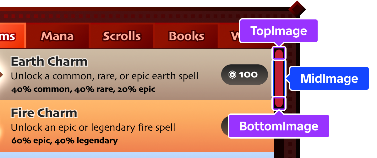
Image that displays on the bottom of a vertical scroll bar, or the right of a horizontal scroll bar (rotated 90° counterclockwise for a horizontal scroll bar).
| Thread safety | ReadSafe |
|---|---|
| Category | Scrolling |
| Loaded/Saved | true |
History 7
- 731 Change Default of BottomImage from to ContentId(rbxasset://textures/ui/Scroll/scroll-bottom.png)
- 726 Change Default of BottomImage from ContentId(rbxasset://textures/ui/Scroll/scroll-bottom.png) to
- 645 Change ValueType of BottomImage from Content to ContentId
- 553 Change Default of BottomImage from to ContentId(rbxasset://textures/ui/Scroll/scroll-bottom.png)
- 486 Change ThreadSafety of BottomImage from ReadOnly to ReadSafe
- 462 Change ThreadSafety of BottomImage from to ReadOnly
- 149 Add BottomImage
BottomImageContent
| Type | Default | |
|---|---|---|
| Content | ||
Image that displays on the bottom of a vertical scroll bar, or the right of a horizontal scroll bar (rotated 90° counterclockwise for a horizontal scroll bar). Only supports asset URIs as textures.
| Thread safety | ReadSafe |
|---|---|
| Category | Scrolling |
| Loaded/Saved | true |
History 3
- 731 Change Default of BottomImageContent from to
- 726 Change Default of BottomImageContent from to
- 677 Add BottomImageContent
CanvasPosition
| Type | Default | |
|---|---|---|
| Vector2 | 0, 0 | |
Reflects the current positional offset of the canvas within the frame, in pixels, and sets the position of scroll bars accordingly. Note that this property doesn't do anything if scroll bars aren't visible.
| Thread safety | ReadSafe |
|---|---|
| Category | Scrolling |
| Loaded/Saved | true |
History 6
- 731 Change Default of CanvasPosition from to Vector2(0, 0)
- 726 Change Default of CanvasPosition from Vector2(0, 0) to
- 553 Change Default of CanvasPosition from to Vector2(0, 0)
- 486 Change ThreadSafety of CanvasPosition from ReadOnly to ReadSafe
- 462 Change ThreadSafety of CanvasPosition from to ReadOnly
- 149 Add CanvasPosition
CanvasSize
| Type | Default | |
|---|---|---|
| UDim2 | {0, 0}, {2, 0} | |
Determines the size of the scrollable area. For an adaptive alternative
based on the overall size of children within the ScrollingFrame,
consider using
AutomaticCanvasSize.
| Thread safety | ReadSafe |
|---|---|
| Category | Scrolling |
| Loaded/Saved | true |
History 6
- 731 Change Default of CanvasSize from to UDim2({0, 0}, {2, 0})
- 726 Change Default of CanvasSize from UDim2({0, 0}, {2, 0}) to
- 553 Change Default of CanvasSize from to UDim2({0, 0}, {2, 0})
- 486 Change ThreadSafety of CanvasSize from ReadOnly to ReadSafe
- 462 Change ThreadSafety of CanvasSize from to ReadOnly
- 149 Add CanvasSize
ClearInertialScrolling
| Parameters (0) | ||
|---|---|---|
| No parameters. | ||
| Returns (1) | ||
| null | ||
| Security | RobloxScriptSecurity |
|---|---|
| Thread safety | Unsafe |
History 3
- 573 Change ReturnType of ClearInertialScrolling from void to null
- 462 Change ThreadSafety of ClearInertialScrolling from to Unsafe
- 392 Add ClearInertialScrolling
ElasticBehavior
| Type | Default | |
|---|---|---|
| ElasticBehavior | WhenScrollable | |
This property determines if and when elastic scrolling is allowed on touch‑enabled devices. Defaults to WhenScrollable.
| Thread safety | ReadSafe |
|---|---|
| Category | Scrolling |
| Loaded/Saved | true |
History 6
- 731 Change Default of ElasticBehavior from to WhenScrollable
- 726 Change Default of ElasticBehavior from WhenScrollable to
- 553 Change Default of ElasticBehavior from to WhenScrollable
- 486 Change ThreadSafety of ElasticBehavior from ReadOnly to ReadSafe
- 462 Change ThreadSafety of ElasticBehavior from to ReadOnly
- 329 Add ElasticBehavior
GetSampledInertialVelocity
| Parameters (0) | ||
|---|---|---|
| No parameters. | ||
| Returns (1) | ||
| Vector2 | ||
| Security | RobloxScriptSecurity |
|---|---|
| Thread safety | Unsafe |
History 2
- 462 Change ThreadSafety of GetSampledInertialVelocity from to Unsafe
- 392 Add GetSampledInertialVelocity
GetScrollVelocity
| Parameters (0) | ||
|---|---|---|
| No parameters. | ||
| Returns (1) | ||
| Vector2 | ||
Returns a Vector2 representing the current inertial scroll
velocity after the user stops their input, for example lifts their finger
off the ScrollingFrame on a touch-enabled device.
Note that this method may only produce noticable data on an actual device or in an emulated scenario from Studio's Device Emulator.
| Thread safety | Unsafe |
|---|
History 1
- 703 Add GetScrollVelocity
HorizontalScrollBarInset
| Type | Default | |
|---|---|---|
| ScrollBarInset | None | |
Indicates whether the scrollable canvas is inset by ScrollBarThickness to account for the horizontal scroll bar. Because the horizontal scroll bar occupies space along the bottom edge, this inset reduces the canvas height. Defaults to ScrollBarInset.None.
| Thread safety | ReadSafe |
|---|---|
| Category | Scrolling |
| Loaded/Saved | true |
History 6
- 731 Change Default of HorizontalScrollBarInset from to None
- 726 Change Default of HorizontalScrollBarInset from None to
- 553 Change Default of HorizontalScrollBarInset from to None
- 486 Change ThreadSafety of HorizontalScrollBarInset from ReadOnly to ReadSafe
- 462 Change ThreadSafety of HorizontalScrollBarInset from to ReadOnly
- 299 Add HorizontalScrollBarInset
MidImage
| Type | Default | |
|---|---|---|
| ContentId | rbxasset://textures/ui/Scroll/scroll-middle.png | |
Image which spans the area between TopImage and BottomImage (rotated 90° counterclockwise for a horizontal scroll bar). This image automatically scales to fill the space between the cap segments.
| Thread safety | ReadSafe |
|---|---|
| Category | Scrolling |
| Loaded/Saved | true |
History 7
- 731 Change Default of MidImage from to ContentId(rbxasset://textures/ui/Scroll/scroll-middle.png)
- 726 Change Default of MidImage from ContentId(rbxasset://textures/ui/Scroll/scroll-middle.png) to
- 645 Change ValueType of MidImage from Content to ContentId
- 553 Change Default of MidImage from to ContentId(rbxasset://textures/ui/Scroll/scroll-middle.png)
- 486 Change ThreadSafety of MidImage from ReadOnly to ReadSafe
- 462 Change ThreadSafety of MidImage from to ReadOnly
- 149 Add MidImage
MidImageContent
| Type | Default | |
|---|---|---|
| Content | ||
Image which spans the area between TopImageContent and BottomImageContent (rotated 90° counterclockwise for a horizontal scroll bar). This image automatically scales to fill the space between the cap segments. Only supports asset URIs as textures.
| Thread safety | ReadSafe |
|---|---|
| Category | Scrolling |
| Loaded/Saved | true |
History 3
- 731 Change Default of MidImageContent from to
- 726 Change Default of MidImageContent from to
- 677 Add MidImageContent
ResetScrollVelocity
| Parameters (0) | ||
|---|---|---|
| No parameters. | ||
| Returns (1) | ||
| null | ||
Resets the inertial scroll velocity of the ScrollingFrame to 0 on both
axes.
| Thread safety | Unsafe |
|---|
History 1
ScrollBarImageColor3
| Type | Default | |
|---|---|---|
| Color3 | 1, 1, 1 | |
Determines how the scroll bar images (TopImage, MidImage, BottomImage) are colorized. When set to white, no colorization occurs. This property is useful for reusing image assets; if the source images are completely white with transparency, you can set the color of the entire scroll bar at once.
| Thread safety | ReadSafe |
|---|---|
| Category | Scrolling |
| Loaded/Saved | true |
History 6
- 731 Change Default of ScrollBarImageColor3 from to Color3(1, 1, 1)
- 726 Change Default of ScrollBarImageColor3 from Color3(1, 1, 1) to
- 553 Change Default of ScrollBarImageColor3 from to Color3(1, 1, 1)
- 486 Change ThreadSafety of ScrollBarImageColor3 from ReadOnly to ReadSafe
- 462 Change ThreadSafety of ScrollBarImageColor3 from to ReadOnly
- 348 Add ScrollBarImageColor3
ScrollBarImageTransparency
| Type | Default | |
|---|---|---|
| float | 0 | |
Determines the opacity of the scroll bar images
(TopImage,
MidImage,
BottomImage). A value of 0 is
completely opaque and a value of 1 is completely transparent
(invisible).
| Thread safety | ReadSafe |
|---|---|
| Category | Scrolling |
| Loaded/Saved | true |
History 6
- 731 Change Default of ScrollBarImageTransparency from to 0
- 726 Change Default of ScrollBarImageTransparency from 0 to
- 553 Change Default of ScrollBarImageTransparency from to 0
- 486 Change ThreadSafety of ScrollBarImageTransparency from ReadOnly to ReadSafe
- 462 Change ThreadSafety of ScrollBarImageTransparency from to ReadOnly
- 348 Add ScrollBarImageTransparency
ScrollBarThickness
| Type | Default | |
|---|---|---|
| int | 12 | |
Thickness of the scroll bar in pixels; applies to both horizontal and
vertical scroll bars. If set to 0, no scroll bars are rendered.
| Thread safety | ReadSafe |
|---|---|
| Category | Scrolling |
| Loaded/Saved | true |
History 6
- 731 Change Default of ScrollBarThickness from to 12
- 726 Change Default of ScrollBarThickness from 12 to
- 553 Change Default of ScrollBarThickness from to 12
- 486 Change ThreadSafety of ScrollBarThickness from ReadOnly to ReadSafe
- 462 Change ThreadSafety of ScrollBarThickness from to ReadOnly
- 149 Add ScrollBarThickness
ScrollToTop
| Parameters (0) | ||
|---|---|---|
| No parameters. | ||
| Returns (1) | ||
| null | ||
| Security | RobloxScriptSecurity |
|---|---|
| Thread safety | Unsafe |
History 3
- 573 Change ReturnType of ScrollToTop from void to null
- 462 Change ThreadSafety of ScrollToTop from to Unsafe
- 325 Add ScrollToTop
ScrollingDirection
| Type | Default | |
|---|---|---|
| ScrollingDirection | XY | |
This property determines the direction(s) in which scrolling is allowed. If scrolling is disallowed in a direction, the associated scroll bar will not appear. Defaults to ScrollingDirection.XY.
| Thread safety | ReadSafe |
|---|---|
| Category | Scrolling |
| Loaded/Saved | true |
History 6
- 731 Change Default of ScrollingDirection from to XY
- 726 Change Default of ScrollingDirection from XY to
- 553 Change Default of ScrollingDirection from to XY
- 486 Change ThreadSafety of ScrollingDirection from ReadOnly to ReadSafe
- 462 Change ThreadSafety of ScrollingDirection from to ReadOnly
- 329 Add ScrollingDirection
ScrollingEnabled
| Type | Default | |
|---|---|---|
| bool | true | |
Determines whether scrolling is allowed on the frame. If false, no
scroll bars will be rendered.
| Thread safety | ReadSafe |
|---|---|
| Category | Scrolling |
| Loaded/Saved | true |
History 6
- 731 Change Default of ScrollingEnabled from to true
- 726 Change Default of ScrollingEnabled from true to
- 553 Change Default of ScrollingEnabled from to true
- 486 Change ThreadSafety of ScrollingEnabled from ReadOnly to ReadSafe
- 462 Change ThreadSafety of ScrollingEnabled from to ReadOnly
- 149 Add ScrollingEnabled
TopImage
| Type | Default | |
|---|---|---|
| ContentId | rbxasset://textures/ui/Scroll/scroll-top.png | |
Image which displays on the top of a vertical scroll bar, or the left of a horizontal scroll bar (rotated 90° counterclockwise for a horizontal scroll bar).
| Thread safety | ReadSafe |
|---|---|
| Category | Scrolling |
| Loaded/Saved | true |
History 7
- 731 Change Default of TopImage from to ContentId(rbxasset://textures/ui/Scroll/scroll-top.png)
- 726 Change Default of TopImage from ContentId(rbxasset://textures/ui/Scroll/scroll-top.png) to
- 645 Change ValueType of TopImage from Content to ContentId
- 553 Change Default of TopImage from to ContentId(rbxasset://textures/ui/Scroll/scroll-top.png)
- 486 Change ThreadSafety of TopImage from ReadOnly to ReadSafe
- 462 Change ThreadSafety of TopImage from to ReadOnly
- 149 Add TopImage
TopImageContent
| Type | Default | |
|---|---|---|
| Content | ||
Image which displays on the top of a vertical scroll bar, or the left of a
horizontal scroll bar (rotated 90° counterclockwise for a horizontal
scroll bar). Only supports asset URIs as textures. Defaults to the
built-in scroll bar top cap texture
(rbxasset://textures/ui/Scroll/scroll-top.png).
| Thread safety | ReadSafe |
|---|---|
| Category | Scrolling |
| Loaded/Saved | true |
History 3
- 731 Change Default of TopImageContent from to
- 726 Change Default of TopImageContent from to
- 677 Add TopImageContent
VerticalScrollBarInset
| Type | Default | |
|---|---|---|
| ScrollBarInset | None | |
Indicates whether the scrollable canvas is inset by ScrollBarThickness to account for the vertical scroll bar. Because the vertical scroll bar occupies space along a side edge, this inset reduces the canvas width. Defaults to ScrollBarInset.None.
| Thread safety | ReadSafe |
|---|---|
| Category | Scrolling |
| Loaded/Saved | true |
History 6
- 731 Change Default of VerticalScrollBarInset from to None
- 726 Change Default of VerticalScrollBarInset from None to
- 553 Change Default of VerticalScrollBarInset from to None
- 486 Change ThreadSafety of VerticalScrollBarInset from ReadOnly to ReadSafe
- 462 Change ThreadSafety of VerticalScrollBarInset from to ReadOnly
- 299 Add VerticalScrollBarInset
VerticalScrollBarPosition
| Type | Default | |
|---|---|---|
| VerticalScrollBarPosition | Right | |
Indicates whether the vertical scroll bar is positioned to the left or right of the canvas. Defaults to VerticalScrollBarPosition.Right.
| Thread safety | ReadSafe |
|---|---|
| Category | Scrolling |
| Loaded/Saved | true |
History 6
- 731 Change Default of VerticalScrollBarPosition from to Right
- 726 Change Default of VerticalScrollBarPosition from Right to
- 553 Change Default of VerticalScrollBarPosition from to Right
- 486 Change ThreadSafety of VerticalScrollBarPosition from ReadOnly to ReadSafe
- 462 Change ThreadSafety of VerticalScrollBarPosition from to ReadOnly
- 299 Add VerticalScrollBarPosition
Removed members 2
AutoSizeCanvas
| Type | Default | |
|---|---|---|
| bool | ||
| Category | |
|---|---|
| Loaded/Saved | false |
History 6
- 290 Remove AutoSizeCanvas
- 287 Add AutoSizeCanvas
- 285 Remove AutoSizeCanvas
- 286 Add AutoSizeCanvas
- 285 Remove AutoSizeCanvas
- 286 Add AutoSizeCanvas
AutoSizeCanvasPadding
| Type | Default | |
|---|---|---|
| UDim2 | ||
| Category | |
|---|---|
| Loaded/Saved | false |
History 6
- 290 Remove AutoSizeCanvasPadding
- 287 Add AutoSizeCanvasPadding
- 285 Remove AutoSizeCanvasPadding
- 286 Add AutoSizeCanvasPadding
- 285 Remove AutoSizeCanvasPadding
- 286 Add AutoSizeCanvasPadding